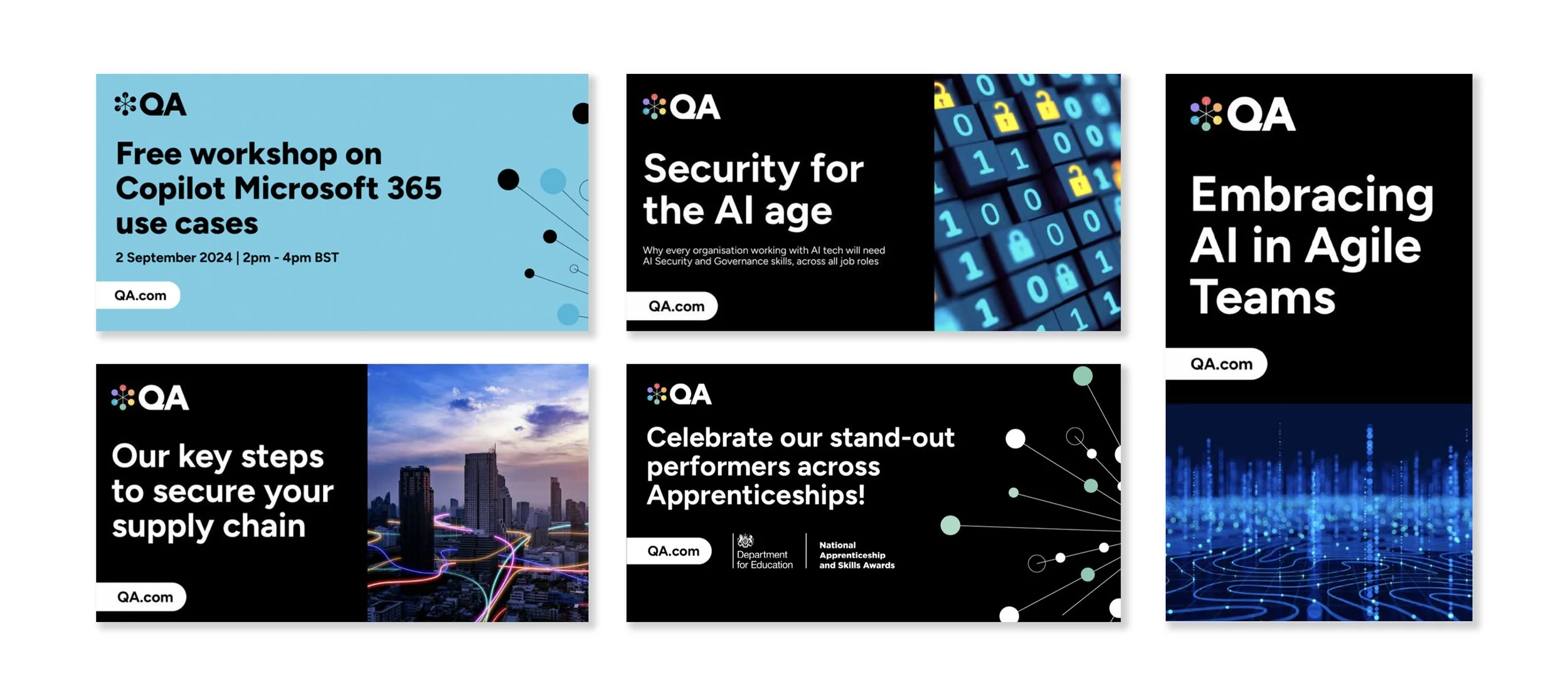
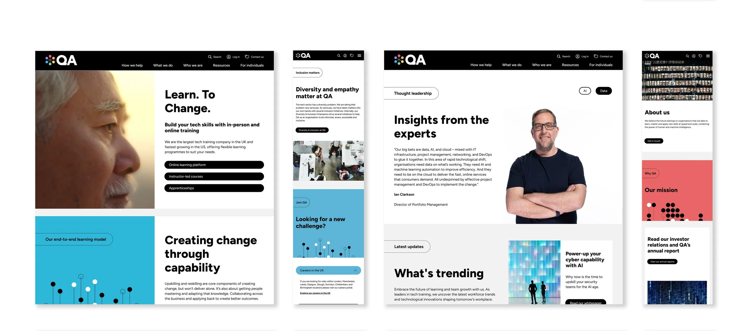
Rebranding 3 organisations into 1
QA group owned three unique learning products - Circus Street, Cloud Academy, and QA. They brought the three organisations together to deliver more value to their clients. I led the creative direction for a rebrand in order to create a single unified identity across the three organisations.

We united three organisations into a single, cohesive brand capable of delivering a larger, more impactful offering to clients. The new identity needed to be bold, credible, and reflective of QA’s £200 million stature. Drawing from QA’s trusted name, Circus Street’s vibrant colour palette, and Cloud Academy’s design elements, we created a brand that honoured its history while presenting a polished image for the B2B market. The tone of voice was crafted to resonate with senior decision-makers, ensuring it felt both authoritative and approachable.
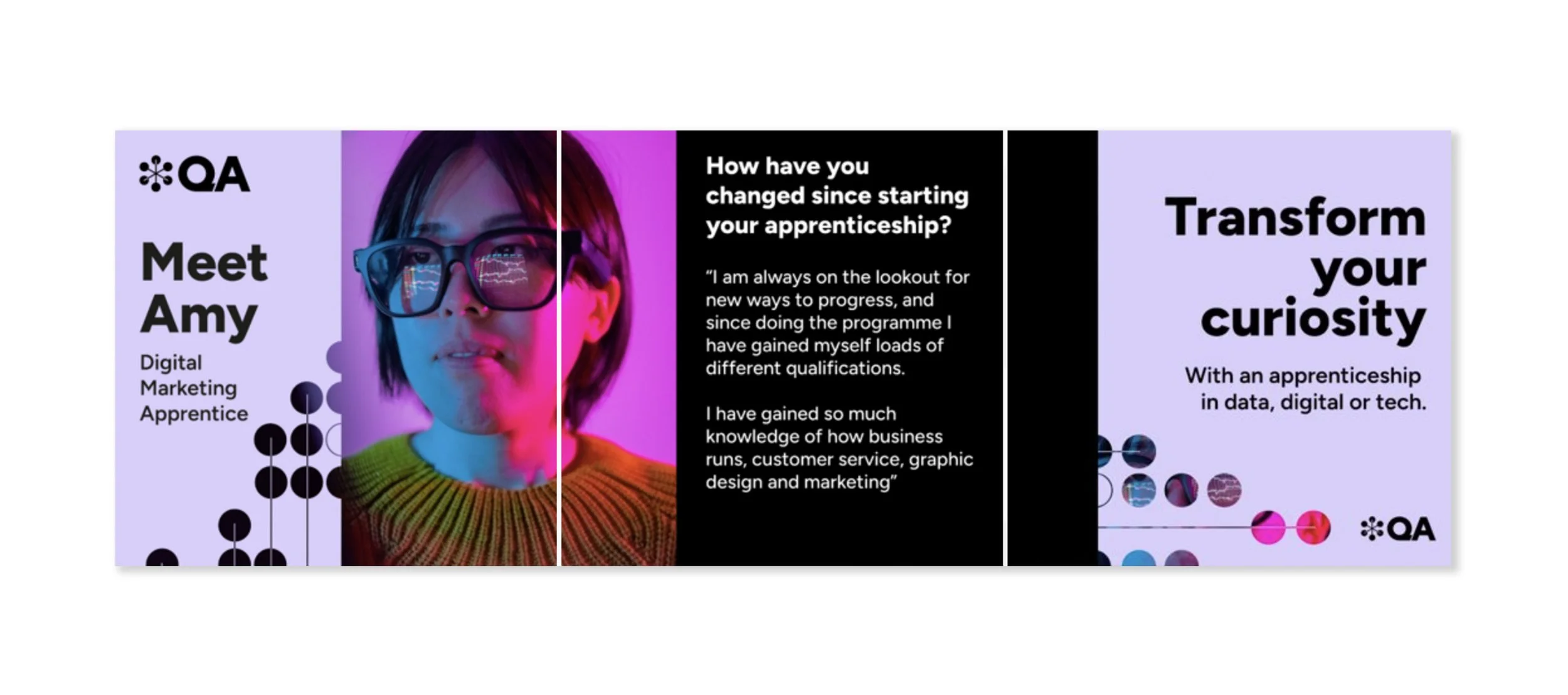
B2C Apprenticeship campaign
QA's apprenticeship division needed a campaign to engage a younger audience, distinct from the usual senior decision-makers. We developed a campaign that stayed on-brand while using softer colors for a more approachable tone. The visuals sparked curiosity, showcasing tech skills through dynamic imagery, like reflections of code or designs on glasses, inviting viewers to imagine themselves in exciting, innovative projects. This approach resonated with the target audience, captured their attention, and aligned seamlessly with QA’s overall brand identity.

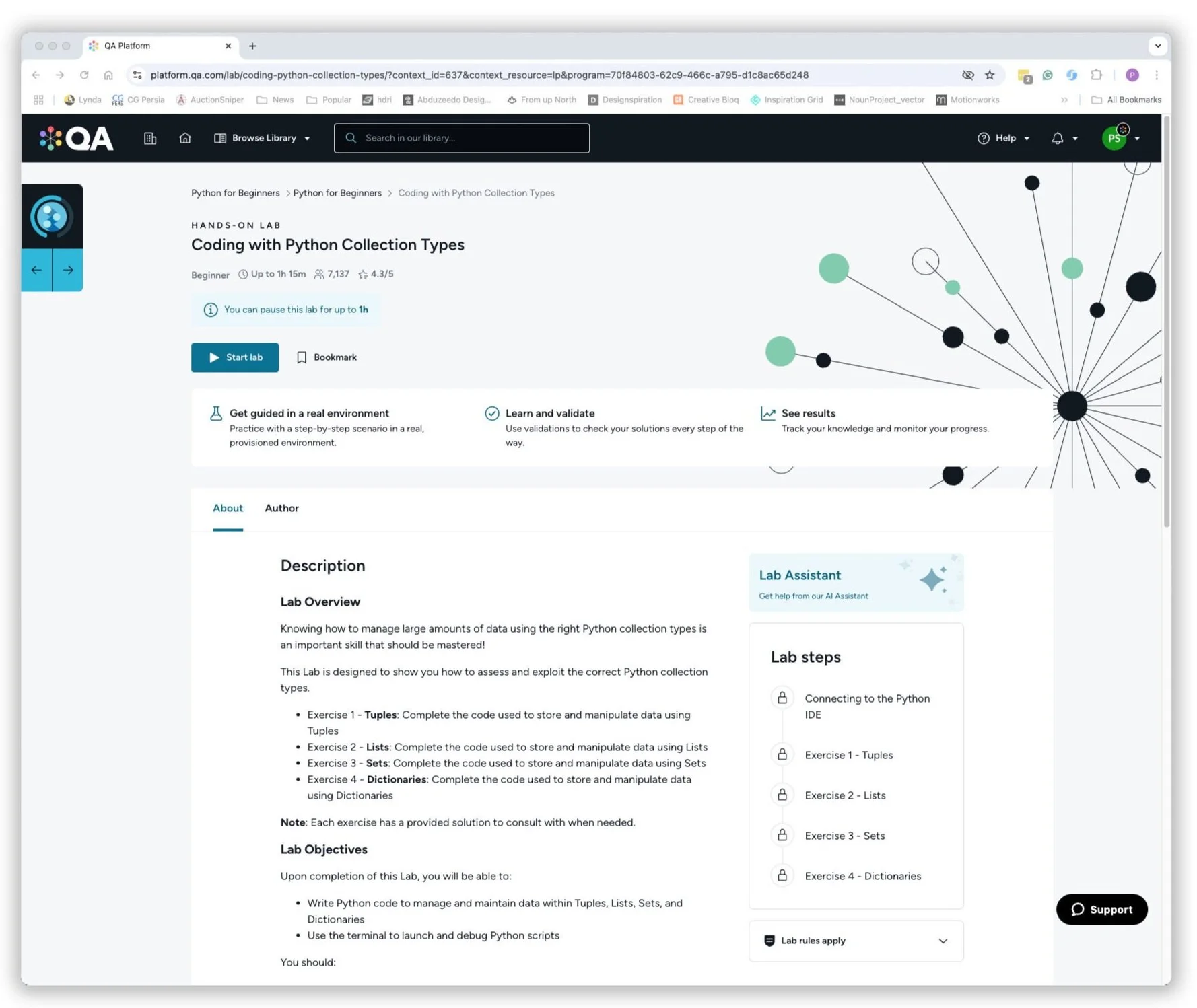
UX Guidance
Creating user-focused designs that meet business goals. I led design sprints and built prototypes to validate ideas by using the data and feedback to refine solutions. Then, prioritising accessibility, maintaining scalable design systems and collaborating with engineers to align with roadmaps. Post-launch, we focused on continuous improvement, ensuring products solve real user problems while staying efficient and consistent.